For five years, colleagues from the University of Canberra’s Centre for Creative and Cultural Research have held an annual letterpress workshop, to which they bring their own writing to set and print. Initial expectations about ideal presentation shifted ground when faced with the intricacies and possibilities of the process. This is an account of their experiences that combines insights from participants with framing observations from my own experience with letterpress, typographic layout and its relationship with creative writing.
Keywords: Letterpress — materiality — poetry — writing practice — print culture
Sometimes interest and opportunity converge: an interest in materiality within the practice of writing, the opportunity to use a letterpress studio. The chance to put theory into practice is taken, five times, and the initial, informal research question What happens to a poem when the poet prints it by hand? quickly turns into What happens to a poet when they print?
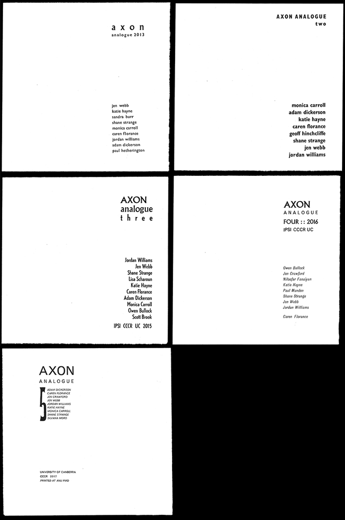
This is an account of the annual Axon Analogue letterpress workshops, undertaken by members of the University of Canberra’s Centre for Creative and Cultural Research every December since 2013. For two days, participants were guided through the process of hand-setting and printing a poem or poetic text of their choice to produce an editioned folio of prints, and once their contribution to the folio was complete, they spent the remaining time on projects of their choice. A core group attended every workshop: writers Jen Webb, Shane Strange, Jordan Williams and artist Katie Hayne. Other regulars were philosopher Adam Dickerson and writers Monica Carroll, Owen Bullock, and Jen Crawford. Each year there were new, single-time people: poets Paul Hetherington and Niloofar Fanaiyan, designers Geoff Hinchcliffe and Lisa Scharoun, cultural theorist Scott Brook, and writing student Silvana Moro. The late Sandra Burr attended the first workshop in person, and ghosted the following folios (it is impossible to reproduce photographically, but on the second folio cover, Sandra’s name is blind embossed at the top of the list). I was the person who guided the groups, as a doctoral student researching material collaboration between poets and printing.
Why did we do it?
Letterpress means something to poetry. Hand-set letterpress is how the look of traditional poetry was established. Since the invention of printing in the 15th century until its utter transformation at the end of the 19th, the process physically demanded a list of straight lines. The printer had to create — compose — a lineated grid of rectangular blocks that need to be clamped together into a forme to withstand the enormous pressure of a machine — a press — bearing down upon it. White space, in letterpress, is demanding; it too, has to be built from metal blocks that are a lower height than the letters so that they don’t print.
For hundreds of years, poetry was straight lines and white space in various combinations. Jean Jacobsen, in her dissertation ‘How Should Poetry Look? The Printer’s Measure and the Poet’s Line’, states:
I look at the changing technology of printing and tools of production, and specifically those of the compositor, from hand‐crafted pages to the output of mechanized presses and revolutions in type casting. The finding which most surprised me was that I could not correlate major changes in printing technology to any major change in the look of the poem: printing presses changed dramatically, but printed poems changed little. (2008: 264)
Until the invention of photography and its consequent use in the printing trade, innovation in poetry layout depended upon either its relationship to image via printmaking processes or an innovation in design within the physical affordances of the process. Examples of the former can be seen in the work of William Blake and the French publishers of livre d’artiste. Blake melds his poetry with his imagery, all drawn by hand backwards on his printing plates (Viscomi 2010: 86-109). Livre d’artiste (artist book) publishing of the late nineteenth and early twentieth centuries used the etching plate, the lithography stone and screenprint silk to integrate text and image, weaving the image into the text, or using the artist’s own handwriting and other hand-lettering in the same visual medium as the imagery (see Johnson 2001: 138-40, 172-73).
The horizontal, linear movement of Mallarmé’s Un Coup de Dés jamais n'abolira le Hansard (1897/1914) is an excellent example of innovating within the restrictions of letterpress. While many read his radical, double-spread horizontal layout as a literal illustration of his words — the movement of a ship pitching through a storm across the gutters of the spine, all the drama of its chances of survival conveyed in erratic spacings and scale of font — its series of long, bouncing movements across the surfaces of page and plunge is also exactly what he states at the beginning: a series of dice-throws, rolling and scattering across the page. There are, however, no curves: to set a curve of text by hand is a feat of composition that is possible but completely uneconomic in printing terms. Apollinaire’s curved and trickling ‘Calligrammes’ (1918) were published four years after the second, more successful attempt to realise Mallarmé’s vision, and there are only a few calligrammes that break free of the spaced grid.1
Handset letterpress ceased being economically viable around the same time that Mallarmé ceased being alive. Thanks to the ceaseless urgency of efficiency and profit, moveable type was pushed aside by machine-setting and photo-setting, and adopted by those who could afford to take the time: private presses. Hand-setting became a cultural marker of luxury and tradition, while experimental urges moved with the times: collage, typewriters, letraset, camera-ready photographic copy, and the computer have, as Jacobsen pointed out, progressed the visual nature of poetry further than 500 years of letterpress.
So our letterpress workshops were initially experiential rather than experimental; there was a romantic sense of being able to make a beautiful version of your own words, to see if an ideal copy could be produced and to have a taste of the considerations that a typographer would undergo when styling book pages.
In fact, poetry typography is driven for the most part by the poet themselves. From the moment of inception, a poem is designed for the page by the poet when they arrange the form or formlessness of their words, giving clear signals to the publisher on how they do or don’t want their poems to look. The biggest misstep by poets and publishers is often font style and size; the power of poetic ‘voice’ can be undermined by an overly-casual font on the page (or, more usually, on the cover).
The Axon Analogue workshops gave the participants a Typography 101 intensive. Letterpress has informed every element of typography on our computers: when we choose a 12pt font on our screens, ‘pt’ means ‘point size’. Letterpress has its own distinct measuring system: Picas and Points. A Pica is around 1/12th of an inch; there are twelve points to a Pica. Using ‘points’ for our screen fonts is a design folly that gives a hat-tip to traditional print culture, as the developers could have easily made everything conform to the decimal system. We can also choose 13pt for our text onscreen but in letterpress, because each text size — and each text style (roman, italic, bold) — involves a physical drawer of cast metal type blocks, there are only certain choices of size: 6pt, 8pt, 10pt, 12pt, 14pt, 18pt, 24pt, 30pt, 36pt, 42pt, 48pt, 60pt, 72pt. After that, printers move to wood type for scale, because it is lighter to carry when set up, and easier to carve into decorative styles.
The participants also learn about type voice and affect, but because of the limited choices available in the letterpress studio, they encounter compromises that can yield surprising amounts of satisfaction. There might be a beautiful font, designed especially for poetry, like Centaur — but there’s only one tray of it, in, say, 12pt Roman. Within that tray there might not be enough letters for the poem in question — poetic writing, even when not rhyming, tends to uses patterns of words that put a lot of demand upon particular letters. A number of participants had false starts when they ran out of a letter halfway through a poem, and regulars now know the time-saving of a quick letter-count on page and in tray.
A contemporary printing studio, at least in Australia, tends to have only a few fonts in any quantity. In the past, a font family was an investment, and each printshop would specialise in a typeface, hence the notion of a house style. Often the participant wants a ‘fancier’ font than Times Roman, but when shown how beautifully Times prints in metal (it was designed for superb printing quality, but its overuse as an ubiquitous office computer font has flattened it), the issue at hand turns to more useful thoughts, like how to best use the available page space.
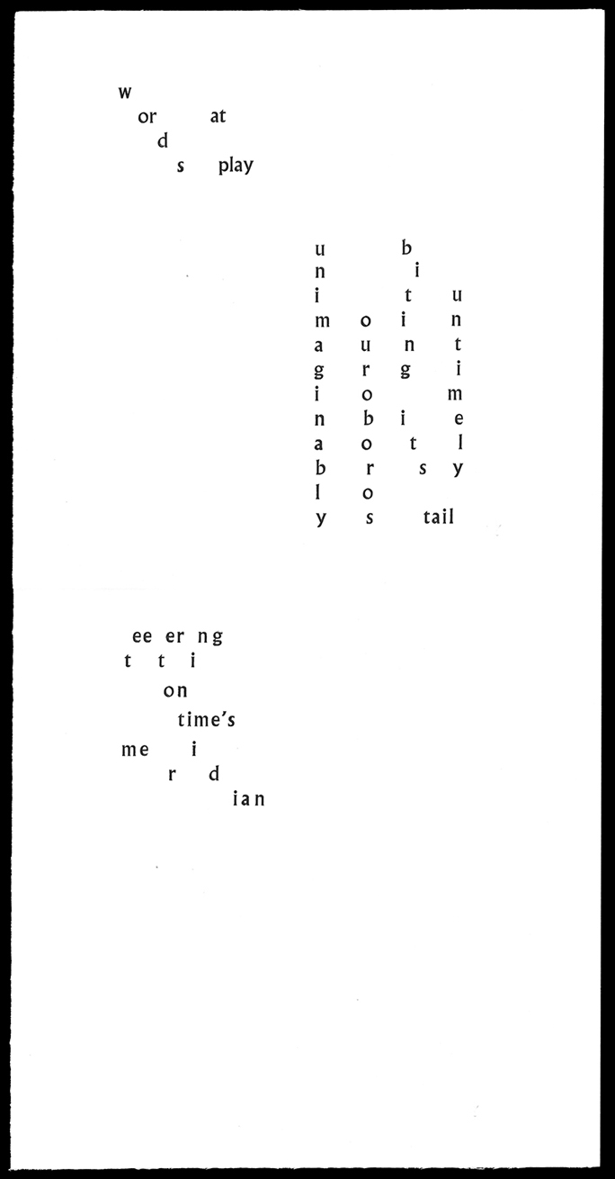
Another peculiarly contemporary issue with poetry layout is the expansion of line length; poets are writing for the screen, or to the width of their A4 Word document, which means that a carefully styled visual poem is often destroyed by necessary turn-overs on a typical book page. With our letterpress project long lines are not a problem, since our folio page is a long rectangle folded down into a 250mm square, but thanks to the press/pressure/forme issue, each line should ideally be the same length to ensure effective clamping. Participants learnt to use a setting or composition stick, in which the longest line is set first to establish the width of the block. If there is a disproportionate difference between the length of the longest line and the rest of the poem, the result is called a fat forme, filled with large quantities of spacing blocks, a leaden grey mass forming what will be ‘empty’ white:
Poets work with two materials, one’s black, and one’s white. Call them sound and silence, life and death, hot and cold, love and loss: any can be the case but none of those yins and yangs tell the whole story. (Maxwell 2012: 11)
In letterpress, black is type-high — 0.981 of an inch — and white is anything below that: surface and substrate, ink and lack. Form and weight.
The setting of a poem is already an interesting exercise when you’re a printer: how to do the words justice with font and space, choosing a paper that will let it live through the fingertips, ensuring the ink bite is subtle and sharp, or deep and overwhelming. When you’re the poet — when you have already dredged and pulled the words into being — setting them again letter by letter can be quite confronting. Everything is in sharp focus. There is time between picking up and placing one letter and the next to think ahead, into, through, around. It creates space for doubt.
This space is common when poets move from handwritten states to computer states of their poems, but even more common when they see the first ‘proper’ typesetting of their work in proof states, sent by their publisher. Walter Ong says that
Print situates words in space more relentlessly than writing ever did. Writing moves words from the sound word to the world of visual space, but print locks words into position in this space. Control of position is everything in print. (1982: 121)
The authority of the printed proof perhaps makes a poet look harder at their words; quite often at this stage a late change will suggest itself. So, too, this occurs in the suspended space of printing composition, the time framed by Schön as the ‘action-present’, ‘a zone of time in which action can still make a difference to the situation’ (1983: 62). Consequently, some of the participants found themselves changing their poems as they set them.
What we did when we did it
Start with trying to come to terms with the machinery and the techniques. Bore myself by just making patterns of letter and space, over and over, then find I'm unbored because without attending to it consciously I’m rewriting my poem as I go, fitting words to lines, running short of one key letter. Gradually realise that fine printing is not my thing and won’t ever be: but play is; and type, space, paper, ink can be all about play. Gradually realise that two days a year is not enough and I want to spend a year there, caring less and less about prosody and more and more about encouraging patterns of letter and space to ignore the conventions and let what will, be. Realise that I don’t understand the weight of ink and I’d need to do it much more to become familiar with it. —Jen Webb
The workshops were driven by the desires of the participants; as the person who knew the most about the process, I was there not so much to teach, but to explain the internal logic of the letterpress studio, operate the press, and to find workable solutions for these desires. In the first year, no one knew what to expect, so the outcomes were either quietly conservative or wildly over-ambitious. Each year, the group developed, and the newcomers were inducted well before the class via hallway conversation, so the induction grew shorter, and the production became smoother and more experimental.
Astrid Lorange writes about poetry’s ‘sense of madeness’ (2014: 36) and compiles ways that writers think about the materiality of writing in terms of composition (‘the way writing is written’), strangeness (engaging with language as a stranger), signifying (phenomenal knowing), affinitive acts (‘bringing things in contact with each other’), and ‘queering … major disruption through minor forms’ such as typos, reproductive glitches and extra spaces (2014: 36-40). Each of these approaches is embedded in the process of setting type by hand: slowing down the mind to work with the hands, the discovery of your own text as a stranger, and seeing the result of the first pull of the press, where mistakes are less of an embarrassing moment than a sudden opening out of playful opportunity.
My experience of using the equipment is of a physical commitment to producing an artwork. I had to sit, hold, stand, carry and repeat many times over to be able to create the arrangements of space and marks. I was able to be physically absorbed in this whereas, with writing, the physical demands are much less and the type of absorption is more emotional/cognitive rather than physical. Over time I brought less of my ‘writing’ self and more of a producing self to the workshop. Over time, I let the conditions of letterpress write me, rather than me use it for my writing. I have been able to expand into production that focuses on sound rather than language/writing. In the last workshop I explored letterpress as a way to bridge music and time by producing sequences. The dimensionality of letterpress seems to seek, from me, more than a flat poem on paper. The practice seeks to be sculptural, dimensional. —Monica Carroll
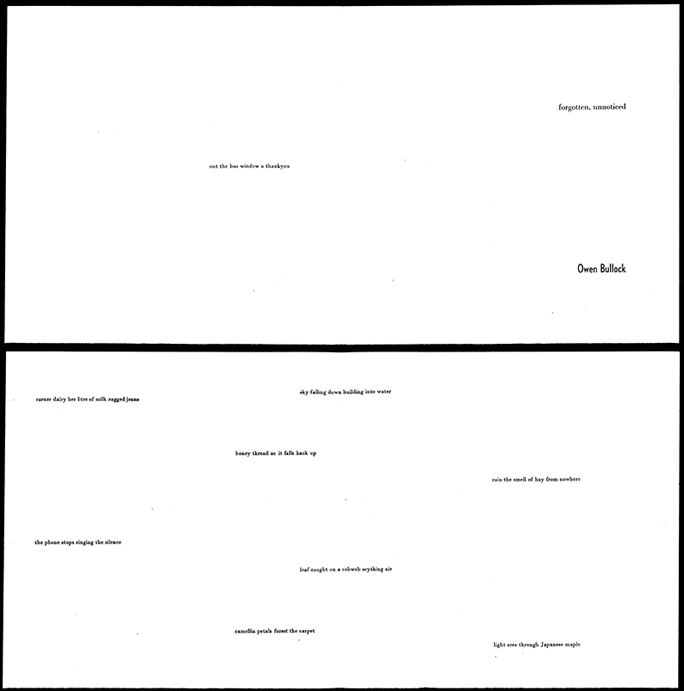
One of the main things typesetting does is to slow you down. It’s fiddly and frustrating for the first hour or so, your fingers are too big and clumsy — no one should be able to handle such slender things as an exclamation mark with skill. But it gets easier. You scrutinise every letter. You wonder if you really need a word and are inclined, even if the poem had seemed finished, to cull some more. Using the press in the final stages of printing is something like a miracle. Go through the ritual of alignment, press the button, let the rollers wheel over the type in the press bed and return with printed paper — it’s a moment to jump up and down like a child. Going to the office printer down the corridor doesn’t get anything like the same reaction, though it’s surely also some kind of miracle. Perhaps the difference is that in letterpress you get to see more of the ‘trick’ but are still amazed. —Owen Bullock
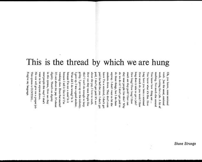
One effect of the physical setting of type on a work of poetry is that it ‘slows down’ the reflexive processes of ‘writing’. That is, while a poem or idea for something might be written, it is in the comparatively slow process of picking letters (and spaces), putting them clumsily, but purposefully, into lines that a kind of meditation on the work opens up. You feel as if you are working with a piece of writing almost at the level of its DNA. In a sense the piece that is being set (no matter how old, no matter how resolved) gets rewritten. There is immense satisfaction in the physicality of the work. Lifting drawers of lead type, bending over a composition frame for hours on end, inking a roller, printing a proof, fixing the inevitable mistakes, and finally turning the work out. Maybe all poets should have to write this way, to see if they really mean it. [It also engenders] an increased appreciation of space. Space in letterpress isn’t something that appears where the letters aren’t, but a positive, material ‘thing’ that needs to be considered and negotiated. Actual pieces of lead act as ‘space’, and the combinations of letters and space work as a material whole against a greater space, that of the page. When I read printed material now, particularly poetry, I am aware of this space in a much keener way than I had been previously. —Shane Strange
Contemporary letterpress has a number of performative manifestations. The most common one is to perform materiality: like any form of relief printing, the paper is pushed against a matrix to produce effect, and since the traditional aspiration to print perfectly without indent on the surface of the paper (a ‘kiss’ print) has been fully realised by digital printing, most letterpress printers strive for imperfection and indentation (or a ‘mash’ print, as the old salts say, disparagingly). Jordan Williams, whose research practice centres upon digital poetics, came to each workshop after her first with a poem that could use the materiality of the print to best effect. ‘Fine Bone China’ (2014) had its text neatly blocked on the inside page of the folded folio, but the title was deeply blind-embossed on the cover side, transforming the creamy whiteness of the Italian mold-made rag paper into porcelain. The next year she played with type size to perform breath.
By 2017, she joined force with the press itself, printing her poem about a flapping moth on the press in black, and then hand-rolling and printing the frantic movement of the wings by slapping and shifting the paper onto the colourfully-inked type.
The actions of letterpress also allow it to serve the theoretical and metaphorical exploration of themes like time, tactility, labour, weight, wear, repetition, damage, nostalgia, sound, conversation, frustration, concentration, care, construction, loss ... through both the doing (experiential studio time) and the done (the resulting artefact).
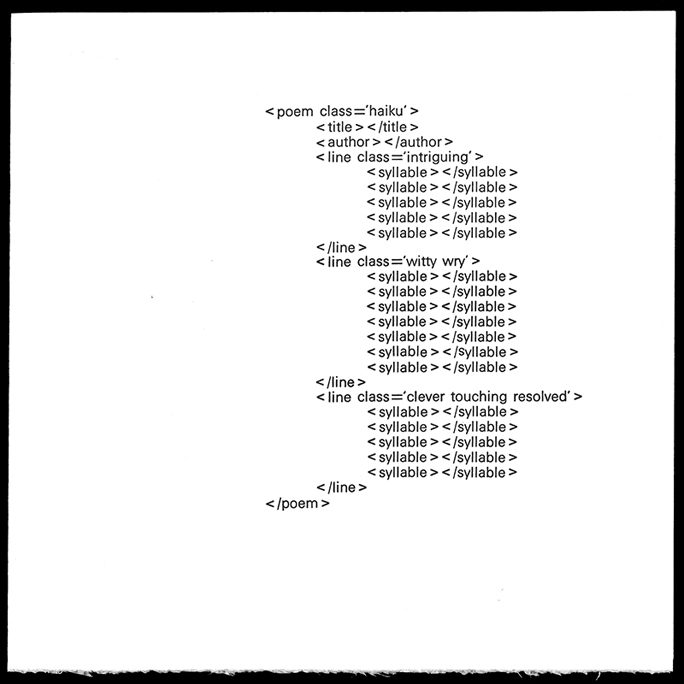
Geoff Hinchcliffe, a design academic whose practice is deeply embedded in performative code, was also trained in letterpress as a young visual arts student, using the same letterpress equipment as the Axon workshop. He attended in 2014, using his time to construct a witty print that brought the digital back to the analogue:
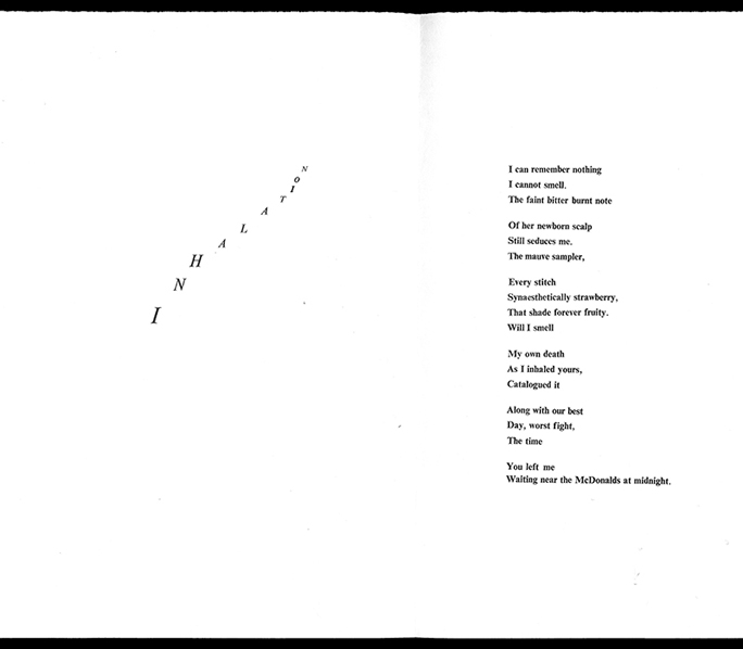
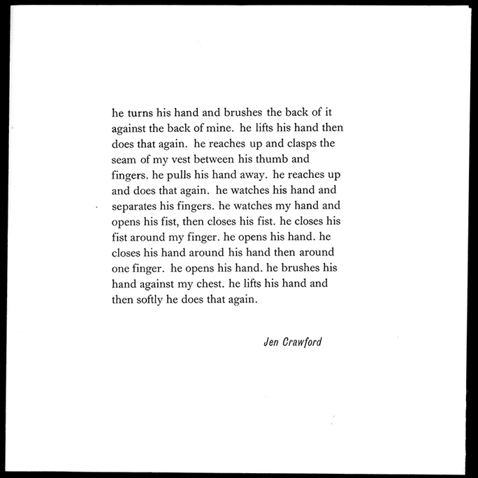
Jen Crawford, by learning to set type, piece by piece, mirrored the iterative learning of her infant son:
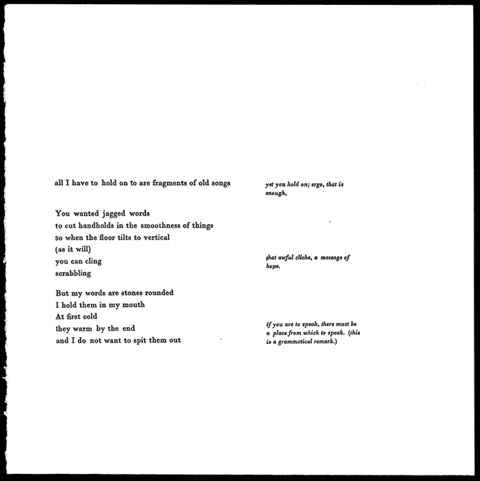
And Adam Dickerson works with fragments, with the ‘jagged words’ of his text seeming to make the letterpress production push forward rather than sit back quietly.
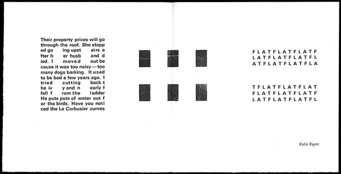
Katie Hayne, who is the heart and spine of the Centre, is also a practicing visual artist and a trained graphic designer. Each year she has produced a typographic print that ties in with the preoccupations of her practice but doubles as visual poetry. In 2016 her print was about the destruction of Canberra’s inner-city community housing, specifically the examples of 1960s Brutalist architecture. She used large spacing blocks, called furniture, and raised them to the printing level of ‘type high’ (0.018”) and then echoed their shape within the text, deconstructing and exploding the architecture outwards.
There is something to be said about working with your hands. With a computer, you are at the whims of the program and its designers but with a letterpress, you are the designer from start to finish, limited only by your imagination. Getting to work with the letterpress at ANU gave me a new appreciation for what goes on behind the scenes and the thought and care that goes into any layout project. —Silvana Moro
A powerful sense of grief closes over you as the end of the workshop nears, but it’s offset by the slow process of putting type away in their drawers. It’s cleansing and cathartic and by the time you’ve managed that and helped tidy up you’re ready to leave — and wonder when the paper will be dry. —Owen Bullock
As cumbersome and heavy as a hand-set letterpress studio is, with its large industrial machines and multiple cabinets of type, it leaves a small footprint in terms of waste and detritus. Each person sets their text, prints the number of copies they need, and then the text is dismantled, distributed — ‘dissed’ in industry parlance — back into their respective drawers. A sense of grief is palpable when destroying something that has taken hours, or days, to construct, but this is offset by the sheer pleasure of the experience (the doing), and the resulting artefact (the done).
Every participant in the five workshops has come away with new insights into their textual practice. The artefacts have been collated into yearly portfolios, wrapped in soft, scrunched colourful Japanese momigami paper wrappers. We printed enough for each person, one for the National Library of Australia, and a couple of extras to keep in the Centre for Creative and Cultural Research to show off, give away, and remind ourselves that writing is a process, and that printing matters.
More printed work and working images can be viewed online:
https://www.flickr.com/photos/ampersandduck/collections/72157690931372222/
Notes
1. Mallarmé drew his initial idea for Un Coup de Dés by hand. It was easily achievable by letterpress, but the first 1897 printing was deemed unsatisfactory, probably because of the letterpress printer’s interpretation rather than any failings of the process. Mallarmé’s death in 1898 prevented his taking direct action in the matter, and something much closer to his own desires wasn’t achieved until a private press took matters in hand in 1914, using exactly the same technology. Parts of all three versions can be seen at http://www.writing.upenn.edu/library/Mallarme.html (accessed 2 Feb 2018).
Apollinaire, G 1918 Calligrammes: poèmes de la paix et da la guerre, 1913–1916, Paris: Mercvre de France. Digitised copy at https://archive.org/details/calligrammespo00apol (accessed 2/2/2018)
Jacobson, J 2008 ‘How Should Poetry Look? The Printer's Measure and Poet's Line.’ Doctoral thesis, University of Minnesota
Johnson, RF 2001 Artists' Books in the Modern Era 1870-2000: The Reva and David Logan Collection of Illustrated Books, Fine Arts Museums of San Francisco
Lorange, Astrid 2014 ‘On Language as Material’, Das Super Paper 33 (November): 36-40
Maxwell, Glyn 2012 On Poetry, London: Oberon Books
Ong, WJ 1982 Orality and Literacy: The Technologizing of the Word, London: Methuen
Schön, DA 1983 The Reflective Practitioner: How Professionals Think in Action, New York: Basic Books
Viscomi, J 2010 ‘Blake's Illuminated Word’, in John Dixon Hunt, David Lomas and Michael Corris (eds), Art, Word and Image: 2000 Years of Visual/Textual Interaction, London: Reaktion Books, 87–109